Designing forms
This page is still being worked on. If you'd like to contribute, feel free to join our slack channel!
Go back to learn.

A well-designed form is an efficient way to convey information and can save both the sender and the recipient time, frustration, and costs. In this bite, you will learn how to make forms as user-friendly and accessible as possible.
A user does not come to your website for a form, but for what is on the other side of it. Sometimes, a form becomes a barrier between the user and their goal. Therefore, the form should help users reach their goal as clearly and simply as possible. ~Ed Boon
Preparation
Before starting the design, the purpose and content of a form need to be determined. This can greatly improve accessibility already. Consider the following:
- Explain the function and relevance of the form immediately. Use a clear and literal title, and add an introductory text if necessary.
- If a time limit is strictly necessary, inform the user before they start filling out the form. Always provide the option to easily extend the time limit.
- Ask only necessary questions: Always think carefully, "Do I really need this information?". The more questions you can eliminate, the smoother the form will be, and the more you respect the privacy of your users.
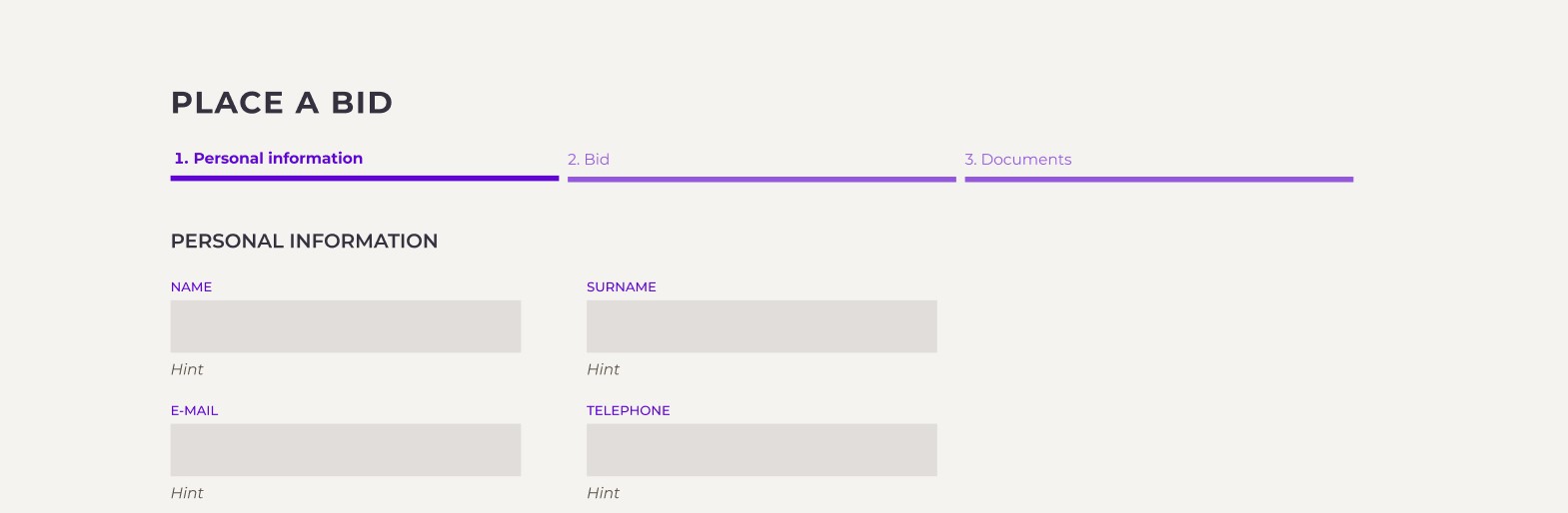
- Sort and group questions logically: By asking questions in a logical order and dividing related questions into blocks, you make the form more understandable. Do not think from the organization's perspective or how you will use the questions, but consider your target audience. Provide clear headings for each group.
- Consider dividing long forms into stages. This way, the user is not overwhelmed by a wall of input fields but can be guided step by step through the process.
Language Use
Now that your questions are determined and grouped, how do you write them well?
- Keep your questions short and concrete so that the user can easily scan and understand them.
- Avoid difficult terms. Test if your terms meet B1 language level with IshetB1.
- Be literal: Avoid metaphors, culture-related references, or jokes. These can be misunderstood.
- Use your tone-of-voice moderately: Forms are a functional means to an end. Therefore, keep texts short and straightforward and do not add unnecessary branding.
Language and accessibility go hand in hand. If the text about a product is difficult to understand, your product won’t be accessible.
Clear language helps everyone, but it is particularly helpful for:
- People with low literacy skills, such as those with cognitive impairments.
- Non-natives of English. Besides people with a migration background, think of people who use sign language as their native language.
- People with autism, who often have more difficulty with comprehensive reading.
- People with dyslexia. In addition to understandable language, they also benefit from good formatting with headings, bullet points, and sufficient spacing between lines.
If you want to learn more about accessibility, take a bite out of Language use.
Design
Now that you have written beautiful questions, it's time to design!
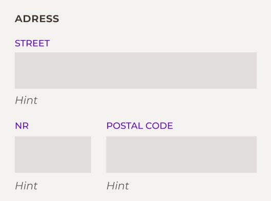
Position your text label in the right place
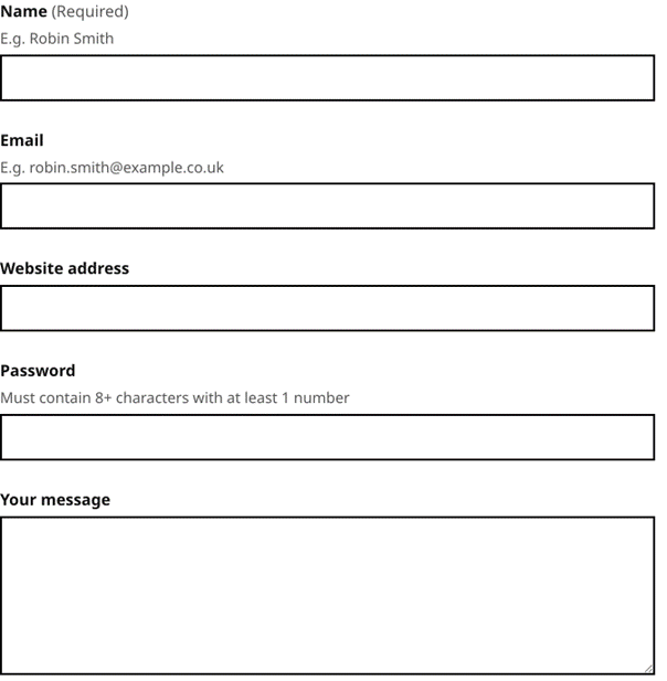
A good label is placed above the input field. This works best for keyboard navigation, which goes from top to bottom. It also allows room for longer labels (such as when the translation is a longer word). Additionally, labels placed next to the field are difficult to align due to varying word lengths. Often, labels are aligned to the left of the page and input fields to the right, creating a large distance between the label and the field. This can make it difficult for people with visual impairments such as cataracts or those who zoom in to see the label. They won’t have a on what to fill in.
Avoid using placeholder text
Many forms have an example of the expected input already placed in the input field. This leads to several accessibility issues:
- Placeholder text is often visually indicated with low contrast, making it difficult or impossible for people with visual impairments to read.
- The text can be confused with pre- entered text.
- Placeholder text disappears once the input field receives focus, causing valuable information to vanish right when it is needed.
Instead of placeholder text, use help text.
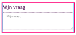
Use help text instead
Sometimes it's helpful to add additional text to an input field on a website. This is called optional help text. It can assist users in understanding what is being asked and why.
Here are some best practices:
- The best place for help text is between the label and the input field.
- Sometimes it can be annoying to have too much help text. Therefore, you can choose to hide the help text, but it's better to display it by default. However, consider when it's useful to hide it behind a help button.
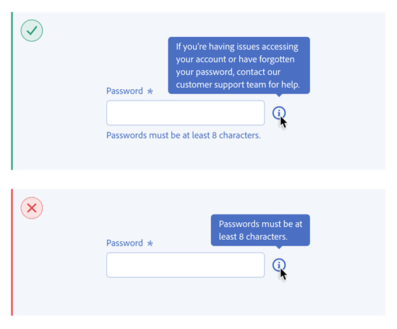
- You can make help text appear when the user hovers over the field or selects the field. Take into account touch devices where hover animations are absent.
Provide visual cues for the expected input
Sometimes the requested input has a specific format. In such cases, it can be helpful to design the input field in a way that makes the format recognizable. For example, a short field can indicate that a short answer is expected.
Do make sure that each correct user response fits within the field.
Avoid dropdown menus and open fields
When creating forms, it's important to keep them simple. If you have too many open fields where users can input anything, there's a chance that people will provide wrong or unnecessary additional information.
Dropdown menus are a convenient solution when selecting one answer from a long predetermined list, but they are often not very accessible. If the list of options is not too long, you can use radio buttons instead of a dropdown menu. This way, all options are visible, enhancing understanding of the question.
Dropdown menus with multiple levels are almost impossible to make accessible. They are also too complex and quickly overwhelm users. Therefore, always avoid using them.
Use textareas
Textareas are open input fields intended for when more than one line of text can be expected. Make sure that these fields’ height (and possibly width) can be adjusted by the user. If you use a maximum number of characters, show this with a counter. If an answer could be longer than 5,000 characters, it is wiser to ask for a Word attachment.
Provide clear feedback
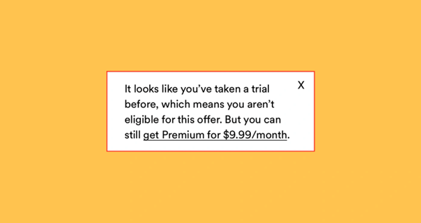
When users enter information into fields, they may make mistakes. It's important to provide feedback so that users know what went wrong and how to correct it.
- Place feedback and error messages below the input field. This shows a better relation with the field compared to when an error message appears only at the top or bottom of the form. Screen readers also encounter the feedback at a logical place if it appears after the input field. Additionally, this ensures that the field itself doesn't shift when the feedback appears.
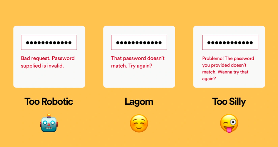
- Be specific: For example, if a required field is left empty, don't just display "Required field," but use "The first name is required." Especially when used with screen readers, explicitly mentioning the field confirms that the feedback pertains to the first name.
Ensure users can contact you at any time
If someone has difficulty filling out a form, you should provide a way for them to contact your organization. You can offer an email address, phone number, chatbot, or links to Twitter or Facebook, for example.
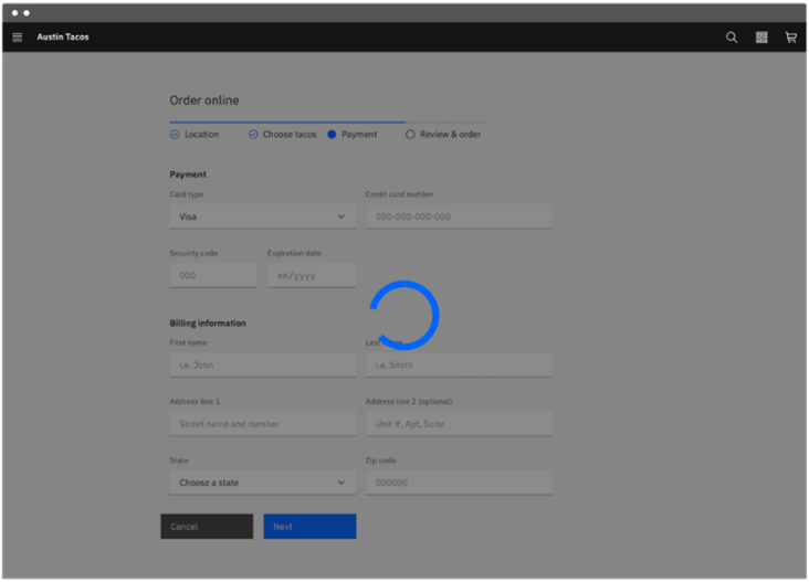
Design a waiting indicator
Sometimes an action, such as submitting a form, can take a little longer. To let the user know that something is happening and that they have to wait, waiting indicators are used. Therefore, design an indicator, as in these examples:
Provide a summary of the filled form
When entering information on a website, it's useful to see what has been entered before submitting, especially if the form consists of multiple steps. Therefore, always design a summary of the entered information.
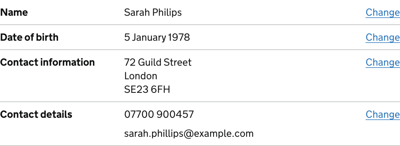
In this overview, always provide an option to edit the data. This can be done with a "back" button, but an even easier way is to have a button per field labelled "Edit." Clicking on it will display the user's answer filled into an input field that can be edited.
Handling of a form
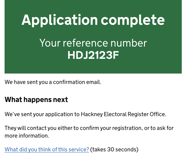
After someone has answered all the questions, there are a few things that still need to be done:
- Confirm that the form has been submitted. The best practice is to redirect users to a confirmation page.
- Some people prefer to receive a confirmation email or have the option to print the confirmation. Provide this option and inform users that a confirmation email will be sent.
- Display a phone number, chat function, or email address so that users can ask additional questions if needed.
- Explain the next steps. Inform users about what will be done with the form and what they can expect.
Wow, well done!
You took a sizable chunk out of the cake of accessiblity today. That's absolutely awesome! Good news: You're done for today! Come back tomorrow for more.
Or take your next bite right now:
References
- macedvisioned - Overview. (2001,June 13). GitHub.
https://github.com/macedvisioned - Visioned. (2023, March 1). Maak formulieren slimmer en toegankelijkervoor iedereen - De Formulierenarchitect. De Formulierenarchitect.
https://www.visioned.net/ - Visioned. (2023a, February 10).Checklist: Hoe maak ik een toegankelijk formulier? - De Formulierenarchitect.De Formulierenarchitect.
https://www.visioned.net/checklist-hoe-maak-ik-een-toegankelijk-formulier/ - Visioned. (2023a, January 31).Stap 1. Komt de klantvraag bij het juiste loket terecht - DeFormulierenarchitect. De Formulierenarchitect.
https://www.visioned.net/stap-1-komt-de-klantvraag-bij-het-juiste-loket-terecht/ - NL Design System. (n.d.). GitHub.
https://github.com/nl-design-system - The Art of the Error Message.(n.d.). Spotify Design.
https://spotify.design/article/the-art-of-the-error-message - Carbon Design System. (n.d.).
https://carbondesignsystem.com/ - Spectrum,Adobe’s design system. (n.d.). Spectrum Design.
https://spectrum.adobe.com/page/tooltip/#Dont-use-tooltips-to-communicate-crucial-information - Confirmation pages – GOV.UK DesignSystem. (n.d.).
https://design-system.service.gov.uk/patterns/confirmation-pages/ - Home | DigiD. (n.d.).
https://www.digid.nl/ - Forms- W3C Design System. (n.d.).
https://design-system.w3.org/styles/forms.html#dealing-with-text - Summary list – GOV.UK Design System. (n.d.).
https://design-system.service.gov.uk/components/summary-list/ - Make the text of your website or appeasy to read for people with low literacy skills. Read Easy.ai is built foreditors, readers and developers.
https://readeasy.ai/ - NL Design System: Dienstverleningvanuit de overheid moet toegankelijk en begrijpelijk zijn voor iedereen.
https://www.nldesignsystem.nl/